Website Photography Tips For The Best Results
10 Minute Read
This post is all about getting what you need from a photoshoot to get the very best results for your website! I recommend reading through this before contacting your photographer, or at least mentioning the pointers in here to them before your shoot. Throughout this post there are buttons that will take you to image collections which reinforce exactly what I am getting at because… A picture is worth a thousand words right?
Okay, here we go. Warning, it starts with a truth bomb…
Amateur images are a sure-fire way to make your site look just that… Amateur. And what do we actually want? A beautiful, professional and quality website. Visitors hit it and within a few scrolls, they are sold on you and your business and want IN! The images on your website will make or break the final look of your lovely new online presence. It sounds severe, but it’s the truth. Happily, there are many amazing photographers out there who will snap your dreamy pictures.
When the rest of a site is beautifully designed, a blurry image stands out even more.
Professional pictures will show off you and your work in the very best light, making it even more attractive to clients. We’ve all been there, you jump on a site and the images are grainy, it doesn’t matter how crisp the rest of the site design is, it is a let-down!
So, for a truly beautiful site, you’ll need to gather some professional images.
When I say professional images, I mean those that have been taken on a professional camera. Clients often ask what ‘file size’ the images need to be. It is not about file size, it is about the quality of the lense that took the picture. Low-quality lenses (read: phone cameras) deliver pictures that are flat with colours that are not as rich. Lens quality > File size!
Looking at past phone snaps you may think they look fine. But, when a low-quality image is pulled full screen on a website, you will be able to see the final effect is not 100% up to spec. Professional images capture the light beautifully and have a depth of colour that shows up best on screen. These are essential aspects which are rare to find with a phone camera.
So, my point?
Professional images will MAKE your site, showcase your business and sell products or services.
Oftentimes small businesses don’t have high-quality images just lying around, so it is common to get a photographer in to take pictures specifically for your website. Below I have compiled a list of pointers to make sure you’re making the most of your photographer’s time and ensuring you and your business are going to shine online.
Top Tip:
My recommendation is that you read through the below and then talk through with your photographer. If you want styled images for your shop, headshots, different locations - communicate that. Discussing exactly what you are after is in everyone’s interest. Communicating exactly what you are after means your photographer can quote you correctly, arrive totally prepared and allow enough time to get all the shots you are after in a relaxed way.
Different Orientations
I am talking: Landscape. Portrait. Square. In that order.
Landscape images are ideal for screen-wide banner images. Using portrait or square images for this purpose can mean they are pulled out so much they blur, even when they are pictures that have been taken using a professional camera. Square images are great for collages whereas portrait images, especially of people, are really effective for story-telling. But. It’s landscape images that are the essential.
Although variety is key when it comes to different orientations of images on websites…
… Landscape is king!
Pictures of YOU
It may be tempting to stay behind the camera and just shoot your work, past projects and offerings but - people want to see who is behind the business and work they are investing in!
It may sound cringe, and it may feel it. But. Doing what you do every day and being in your workspace is a great way to relax in front of the camera. If you are feeling nervous, smile through it, no one will ever know and your website will look so much better for it!

Have the photographer take pictures of you doing what you do;
If you are an artist, pick up some brushes.
A shop = We want to see you interacting with your wares.
Small online biz owner? Show us your desk space, working away on your laptop or taking calls.
Here are some example of people doing what they love to inspire your photoshoot.
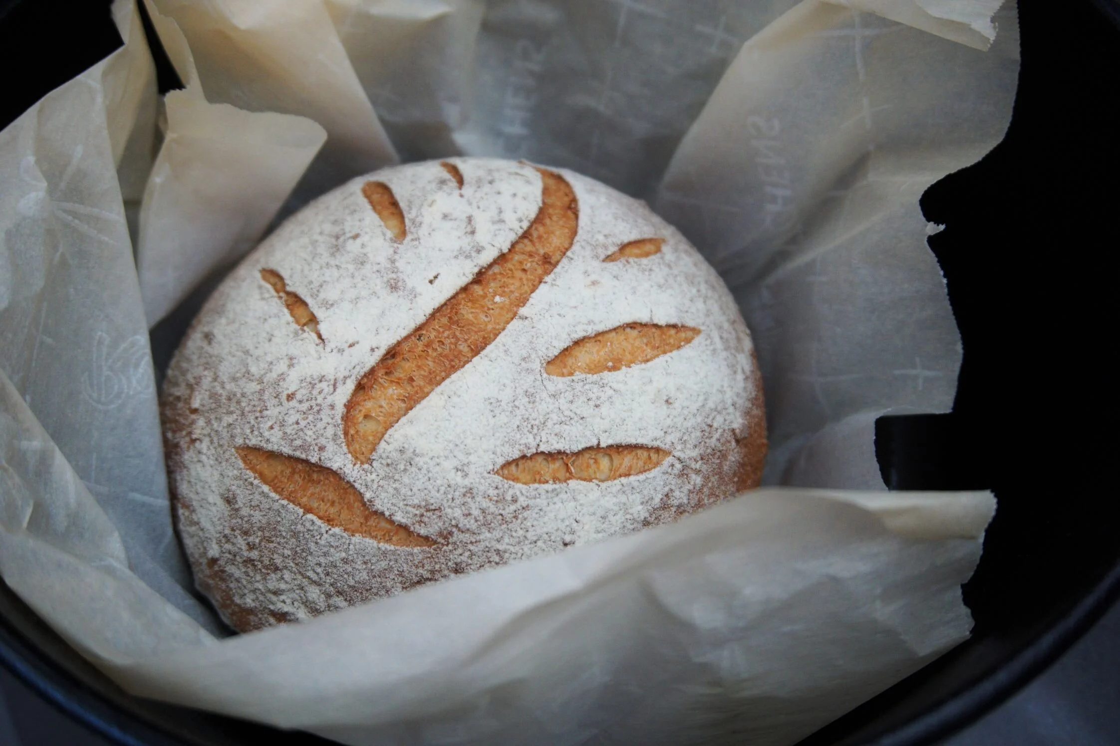
Detailed closeups
Close up imagery is a great way to share the feeling of your work and let customers feel like they are part of the journey. They suggest a sense of intimacy and help people connect with what you do.

The power of closeup images is that they suggest a wider theme without showing the whole picture. This allows for the viewer’s mind to fill in the blanks, placing the image in the imagination and building a more heartfelt and creative picture of the brand.
Not quite making sense? I have collected some example images to for artists and a cafe/bakery. Note the angles, lighting and how the images make you feel!
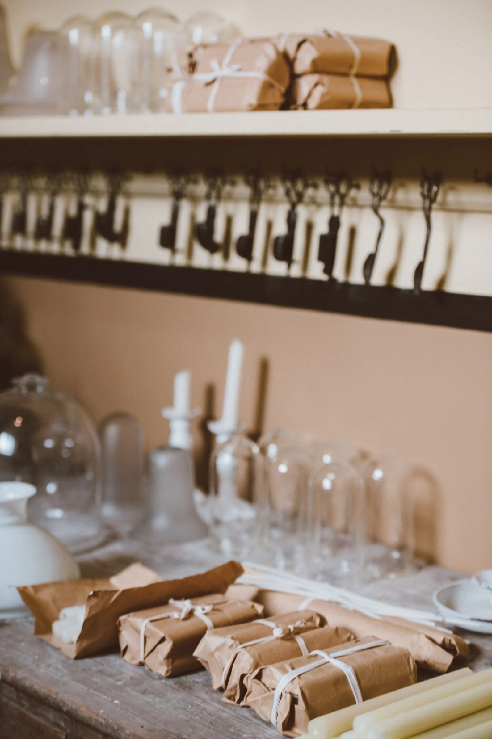
Different item images
It is great to show your items being used in their end-use scenario! Paintings hung in a room, flower bouquets styled on tables…
This helps customers see how your lovely items will fit into their lives.
In addition to ‘in-situ’ shots, images of the items in good light and on a white/plain background are very useful. Take images from different angles also. Site visitors can click into lightbox mode, view the image full screen and see the level of detail that goes into the item. All of these techniques are adding value to your offerings in the eyes of your customer.
When it comes to shop item images → variety is key.
Add a sense of scale to shop images
There is nothing more annoying than ordering something, like a painting or ornament, only to have it arrive and it’s about a third of the size you expected it to be. The way to get around this, and make sure you are not disappointing customers, is by photographing items next to something for scale.

Whether that is a hand, coin, banknote or entire person - anything to give a sense of scale will be invaluable! Whilst written measurements in item descriptions are helpful, it can be quicker to communicate size when something is photographed in someone’s hand than imagining what 25.2 x 45 x 34 cm looks like.
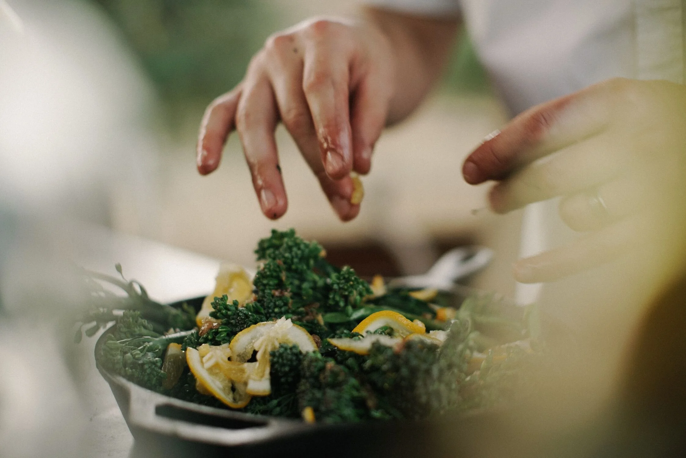
On brand styling
If you know your brand is very relaxed, open and confident - let your images reflect that. Alternatively, if you know that the angle which best appeals to your target audience is disciplined, elegant and refined go for image setups which are clear of clutter.
Example Time
Again, a picture is worth a thousand words so here are two examples for the same product type - Beauty/cosmetics.
Example one: A nature-led, holistic and organic type of beauty brand imagery.
Examples two: Similar items photographed in a way that’s more modern and communicates disciplined luxury.


Have a look at the different images, note the colour schemes, lighting, textures, tones and angles that have been used to achieve the different overall feel. Little props like dried flowers, fabrics or tools-of-your-trade can be a great way to have more texture in images. It also creates a sense of consistency and recognisability in all your pics.
So, here’s the summary on how to shoot the best pictures for your Squarespace website:

Variety of orientations
Some atmosphere close ups, wide angle
Shots of you doing what you do!
Consistent styling
Clear and varied item pictures
Professional pictures, no phone snaps
Feel free to share this with anyone currently in the process of gathering pictures for their website.
Let me know if there is anything else you want to see on this list!
Ottilie Xo